So you have this awesome website. Woohoo! You have all the info about you and your business along with lovely graphics in an organized way. You also have forms and lead magnets in place to get people on your email list. Now you can just sit back and wait for the leads to roll in, right? What do you do if you just hear crickets instead? If you have calls to action and forms but don’t see growth, you may have made it too hard for people to follow through. Let’s examine how to reduce friction points to make it easier for visitors to take advantage of what you have to offer!
What Does it Mean to Reduce Friction?
Dr. Google states the definition of the word friction as “the resistance that one surface or object encounters when moving over another”. While you don’t have physical objects moving over one another on your website, you still have friction. For this scenario, I define a friction point as any obstacle that gets in the way of users completing your goal for them.
Identifying Goals

So the absolute first step in your journey to reduce friction is to identify your goals. If you don’t have a clear understanding of what you want site visitors to do, you can’t clearly identify what keeps them from doing it. Your goals don’t have to be the same as the next person’s, particularly if you have a non-profit organization. Here are some examples of possible website goals:
- Gain more subscribers.
- Sell more online products or subscriptions.
- Perform more free estimates.
- Increase free trials.
What do all of these goals have in common? They are specific and measurable. You don’t want general, unspecific goals here. Bonus points if you say how much you want to increase and give a deadline. You can even have multiple goals for different pages. One part of your site may be for gaining new clients, where another may be for potential employees to express interest.
Effective Ways to Reduce Friction on Any Site
Regardless of the nature of your business or organization, certain steps can help you reduce friction and move those users down your marketing funnel.
Load Speed
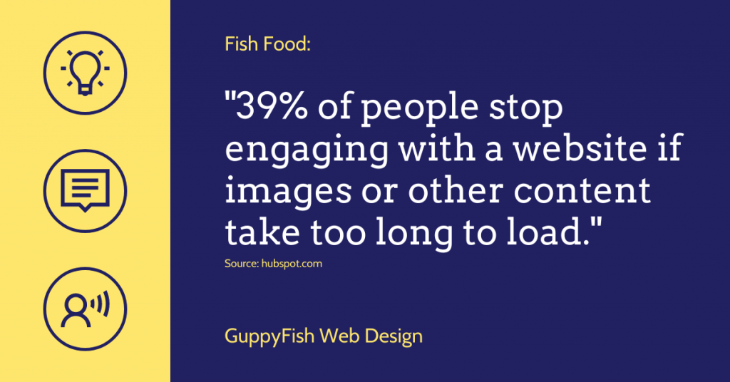
Very little drives users away as much as a slow site. It doesn’t take long for visitors to lose patience if your pages, images, and other items load slowly. This is the first (and most common) friction point. Check out this stat:

You’ve probably been there before. A site takes forever to load, and you lose patience. Working on site speed is a whole post in itself, but Moz offers a great guide to help you get started.
Keep Options Simple
I can’t tell you how many times I’ve gone to a website only to be faced with way too many options. This phenomenon is called decision paralysis, and it happens when you offer too many choices and the user becomes overwhelmed. In most cases, this person will respond by choosing… nothing.
This goes back to the main goal for your website, and (as mentioned above) that can vary depending on the page. If someone visits a particular page, that usually places them in a certain place in your funnel. What’s the next step you want them to take? That option should be front and center with a clear call to action and not surrounded by competing choices.
Require Less on Forms
Have you ever clicked “Subscribe” or followed a link for an offer, only to find a super long form asking for your life history? Seriously… you don’t need to know my dog’s name to send me updates. How many of us have met that kind of form with this reaction?

Very rarely do you need any more information other than an email address for something that is not a purchase. I like to get first name so I can personalize a bit. Too much more, and you drive people away, especially at the beginning of the visitor’s journey with you. Instead, gather information about the new subscriber over time, helping you segment them for a more targeted experience.
Reduce Friction with Organization
If a website is cluttered, disorganized, or difficult to use, visitors abandon it very quickly. Frustration leads to an audience looking elsewhere for what you have to offer. Some web professionals go by the “three click rule”, which states that it should take no more than three clicks to get from your homepage to the desired information. While this is generally true, it’s certainly not set in stone.
Having related links to key services on your homepage, an organized navigation, and a carefully considered layout will work wonders toward keeping users on your site and moving toward conversion.
Look at the Data
Lastly, you want to pay attention to your site’s analytics to find out where you may have friction. What buttons get clicks? Which ones do people ignore? Could you have buried a form in a place where visitors don’t notice it? Familiarize yourself with this data, and use it to drive decisions on design and organization.
What do you do to reduce friction on your website? What is your biggest pet peeve that causes you not to convert on a site? We’d love to hear in the comments. In the meantime, keep swimming along!


0 Comments